As many of you know, I’ve been helping to design and decorate homes over the past few years which is basically a dream come true for me! I began playing with paint colors when we moved into our home just over three years ago. Prior to that we had bounced from condo to condo where I never had much freedom to change anything. When we moved in to our home, I started slapping paint samples up on all of the walls. And when I say samples, I mean I went all out crazy! Seriously, you should see the shelves of sample paints we have collected in our garage. Jack loves it ;) But ultimately I began to uncover some of my favorite colors and took note that although there were 5 million shades of griege, I was easily able to narrow them down to a handful that I loved.
It wasn’t until I took Maria’s workshop a few months ago that I was able to clearly decipher that everything ultimately came down to the undertones when comparing all of the neutrals to one another. It finally gave confirmation as to why one greige could look amazing in my home, but ugly and dingy in another. What it comes down to is comparison. Compare, compare and compare and you’ll be able to see that some neutrals have green undertones and others have purple and depending on your furniture, carpet and other hard finishes, one color will ultimately rise up as the winner. Every home is different and when it comes to neutrals especially, there’s always the disclaimer that each color will look different in every home, and it can even vary from room to room. This isn’t to scare you (I promise) but rather to create an awareness that A) it’s smart to sample (or use a sample board) before you paint an entire room and B) you’re not crazy!
I do plan to discuss more on the topic in the future, but for now, I wanted to share six of my favorite paint colors that I have used time and again. I’ve been fortunate to work with a number of clients where I’ve handled everything from picking paint colors for a room or two to selecting every finish from the outside in on a new build. At least one, if not more, of these colors have been used on just about every project I’ve been involved with. And I should mention that my clients have loved them too, it’s not just me ;) So let me go into a bit of detail as to why I love each one and what spaces I’ve found them to be most useful in.
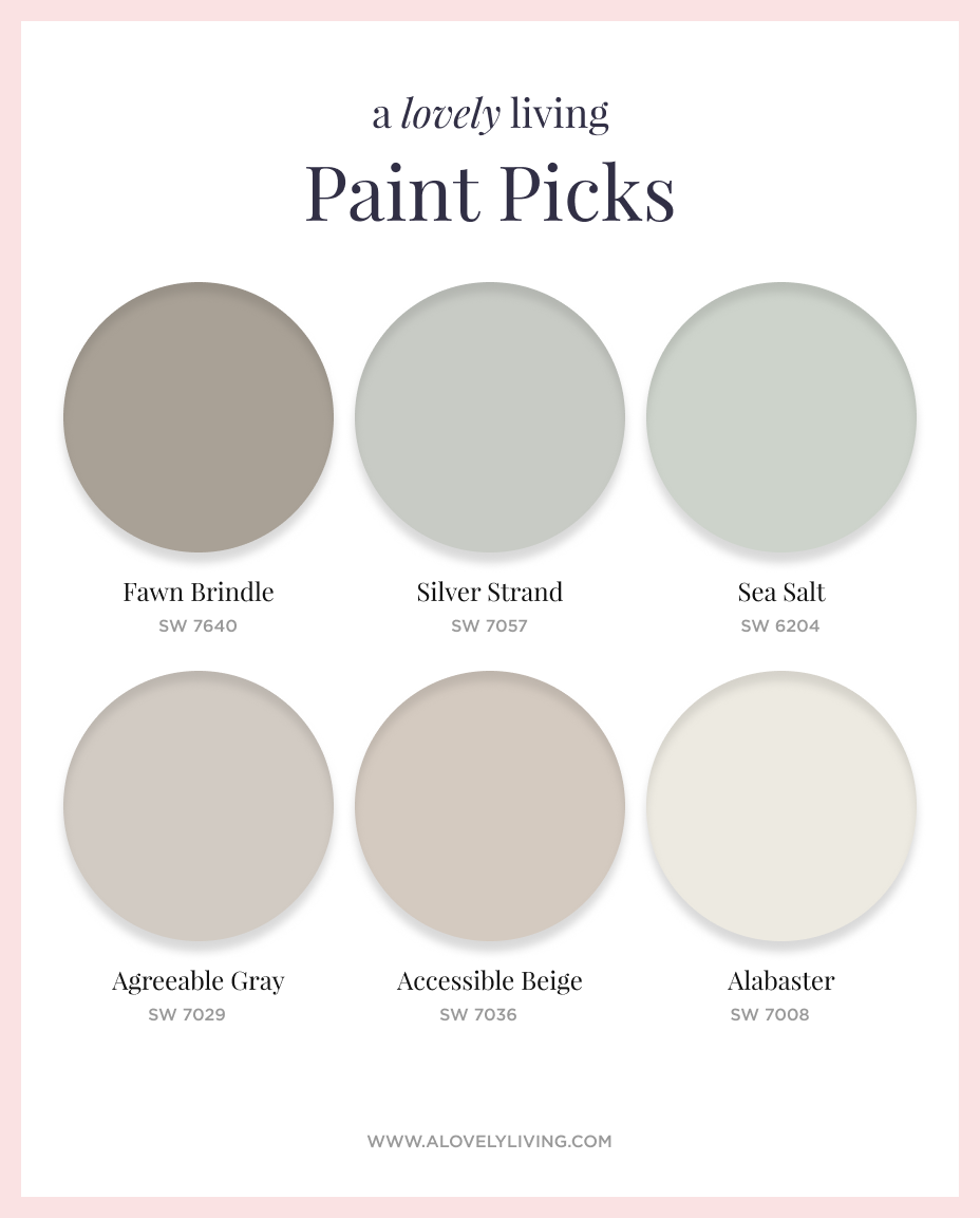
SW Accessible Beige: If I were to have a signature color, most of my clients would agree, it would be Accessible Beige. Although I love elements of gray in decor, I’m not one to go for typical grey walls. When I refer to ‘typical gray’ I’m referring to grays with a blue undertone and a cooler, crisper feel. I prefer the warmer grays/greige’s which is where this color falls. It’s also the color that I have running through the majority of our main floor, our basement, as well as our master bedroom and my sons room. When something works, run with it!
SW Agreeable Gray: I consider Agreeable Gray to fall within the greige category as well, although it certainly feels more gray than Accessible Beige. It has a warm violet undertone which keeps it feeling comfortable and inviting. It’s a very popular gray, as it should be!
SW Sea Salt: This color is such a dream. It is so soft, subtle and serene. It’s a mix of blue and green that in some rooms shows up looking more blue and in others the green can take charge. I don’t mind one way or the other because it always looks phenomenal. I adore this color in bathrooms or powder rooms as it looks beautiful next to the clean whites of the bathroom fixtures. I’ve also seen a number of people use it in their master bedroom where it can also look stunning.
SW Silver Strand: Silver Strand is what I turn to when I’m looking for something a bit more saturated and with a bit more punch than Sea Salt. It reads as more of a blue gray and is still soft and beautiful but with a richness to it. This is another color I turn to for baths and powder rooms.
SW Fawn Brindle: I love throwing this color into the mix of a color scheme. It’s another warm grey that adds beautiful contrast when you’re working with some lighter neutrals. I’ve used it in mudrooms and laundry rooms and love the visual interest it adds as you’re looking and moving from one room to another.
SW Alabaster: White walls seem to be the latest trend, but unless you have room after room full of bright, natural light, you may not be able to pull off an all-out bright white. Alabaster is such a pretty off-white that reads crisp and clean but at the same time offers a beautiful contrast to white trim and baseboards. I used this color in some bedrooms as well as the master bath of a project I recently wrapped up and I can’t tell you how many people were commenting on the color (the builders included!).
I’m most comfortable and have had much success with Sherwin Williams colors, but there are a number of colors from other brands that I’m quite fond of as well. We’ll have to hold out for another post on those down the road!
I’d love to know what some of your absolute favorite paint colors are. Share in the comments and let me know where you use them!

Comments
I have accessible beige in my bedroom and sea salt in my bathroom. I was surprised when I applied sea salt as I thought it was green and ended up more of a aqua but it looks great!I gave my daughter the left over paint and it looks more green in her porch!
Yes, Sea Salt is a pretty even mix of blue and green. I’ve seen it read both ways, but either way is just as pretty! So glad you like it :)
I have fawn brindle in the main floor of my home with lots of white wainscoting. I love the color! I want to paint my interior doors a accent color. Any suggestions?
Hi Missy! Such a great color. Accent doors would depend somewhat on your decor in addition to your wall color. Sometimes black even makes a great accent. I’d have to dive into a consultation to give you a more precise answer, but you could also look into a richer green grey like SW Porpoise.
I am having my living room and kitchen painted accessible beige with pure white trim. I am looking for a color (not white) to paint my kitchen cabinets. My granite is gallo ornamental with a porcelain white back splash and special walnut hardwood floors. Any ideals?I think sea salt too much for cabinets .
Hi Renee! If you’d like to book a consultation, shoot me a message through the ‘paint consulting’ link at the top of the page. That way I can take a look at everything and specify the right color for you!
I am really thinking about fawn brindle for our mushroom and into the kitchen dining area. We have faulted ceilings and redoing our kitchen to all white cabinets and white granite. Will this color make the room look smaller? I have all white right now and I am nervous.
Hi Amy! It’s difficult for me to say if this color will make your room look darker. In comparison to a white, yes, this will certainly be darker, but that’s not necessarily a bad thing. This color can add a beautiful contrast to white and enable the color to feel rich adn beautiful. The amount of natural light will also play a role in this decision. I’d recommend searching for this color on Pinterest to get a better feel for how it reads in various spaces.
Hi Marissa. I just had my kitchen cabinets and my study nook painted alabaster and I am so disappointed. It is way too creamy/yellowish for me. I have black granite. Dark floors and wordly gray was already on the walls. Is there any wall paint color that will brighten up my cabinets and make them appear less yellowy. I don’t like dreading going into my kitchen! It was supposed to take my dark cabinets and transform them into my dream kitchen but no. I feel like nothing matches.
Hi Heather, if you haven’t yet made any changes and you’re still looking for a consultation please reach out to me via my ‘paint consulting’ tab at the top of the page. I receive and respond to those emails much more quickly. Yes, Alabaster would be fairly creamy, especially next to Worldly which has a lovely violet undertone. Happy to discuss options if needed!
Hi, I had accessible gray on the main floor of my old home and want to use it in our new home’s basement that is being finished. I’m looking for a med. dark paint color to use for the trim and doors- something gray/green/beige ish. Suggestions? Thx!
Hi Debbie, the first color that comes to mind is BM Pashmina. And I’m assuming you are referring to Accessible Beige, correct? If you’d like me to look at things more closely and be able to specify more specifically, feel free to reach out using the ‘paint consulting’ tab above.
Sw pure white is a good white color can be used with warm r cool
Tones
Goes with a lot of colors
Alabaster is creamy I see yellow
Yes, both colors fall into the off-white category, but Alabaster does have a stronger yellow undertone to it without quite going creamy.
Hi, Marissa. I would just like to thank you for saving my sanity. I just read how you used accessible beige as your go to color. I sought I knew the Sherman Williams colors by heart at this point, but I have not considered that particular one. It absolutely matches my bathroom tile I had is the perfect accent to Sherman Williams Breezy that I then found for my bedroom. Thank goodness for this as my house is a Chamaeleon. Sea Salt turned baby blue and Repose Grey gets the blues and sometimes purple passions as the day progresses! Lovely, but even after living days with samples painted on the walls. I felt like picking a color was like going on a blind date. Who knows what’s going to turn up! So thank you for unwittingly helping me out. I will be a great follower from here on out
Hi I will be doing my bathroom which has almond and white vanity the walls Silver strand . Would Fawn Brindle be a good pick to paint the vanity and cabinet. Tired of the usual dark brown
Can you please recommend a color to paint my vanity. It does have an almond top with a small white swirl throughout. . I am tired of the normal dark brown colors and baffled as what to do. I plan on using Silver Strand in my north facing room.
I have natural pine trim in my home. Would accessible beige work with that?
I love your general color chioces!
I have come to very similar conclusions.
Considering Fawn Brindle for exterior body paint color.
Any experiemce?
Thank you!
Hi Colleen! Yes, I actually used this on the body of an exterior this past year. If you want to email me I’d be happy to send you an image.
I would love to see the image of the fawn brindle exterior. we are building a new house and I want a French cottage feel and I am considering this color. Thankyou. We are situated in a pine forest in colorado with a valley, creek and cliffs.