You guys know that I love sharing my style inspiration, but coming in as a close second is my love for working with paint. I love finding the perfect color or exact neutral that a room calls for. Understanding the way that undertones play such an important rule in picking paint colors (when it comes to neutrals especially) has made all the difference when specifying colors for my clients. Well, I didn’t understand any of that when I was selecting paint colors for our home 3.5 years ago. I painted a large white square in every room and then painted 10 different shades of greige to sit and stare at. I eventually came to a decision that I was happy with for every space, but it was quite a time (and money) consuming commitment. Studying under Color Expert, Maria Killam last year and making the investment to have her color boards on hand now makes this process exponentially easier! Having the top Sherwin Williams and Benjamin Moore colors on hand to move around and compare/contrast allows me not only to see how each shade would look, but also to show my clients why one color will work better than another.

With all that being said, today I wanted to share one of my favorite neutral paint colors, Sherwin Willams Accessible Beige. This color runs though most of our home including our living room, kitchen, master bedroom and our sons bedroom. These days I feel like the term beige can scare people away. We immediately picture those warm yellow and orange beiges of decades past and in fear turn to a grey that may end up feeling too cold. Accessible Beige actually borders being a gray and falls into the greige category. It technically has a green undertone but it can be a bit of a chameleon in different spaces. It gives a great warmth to our walls that I absolutely love and I have carried that love into a number of other homes that I’ve had the chance to work in. I wanted to share some of those spaces with you today so I can make a case for this beautiful hue.
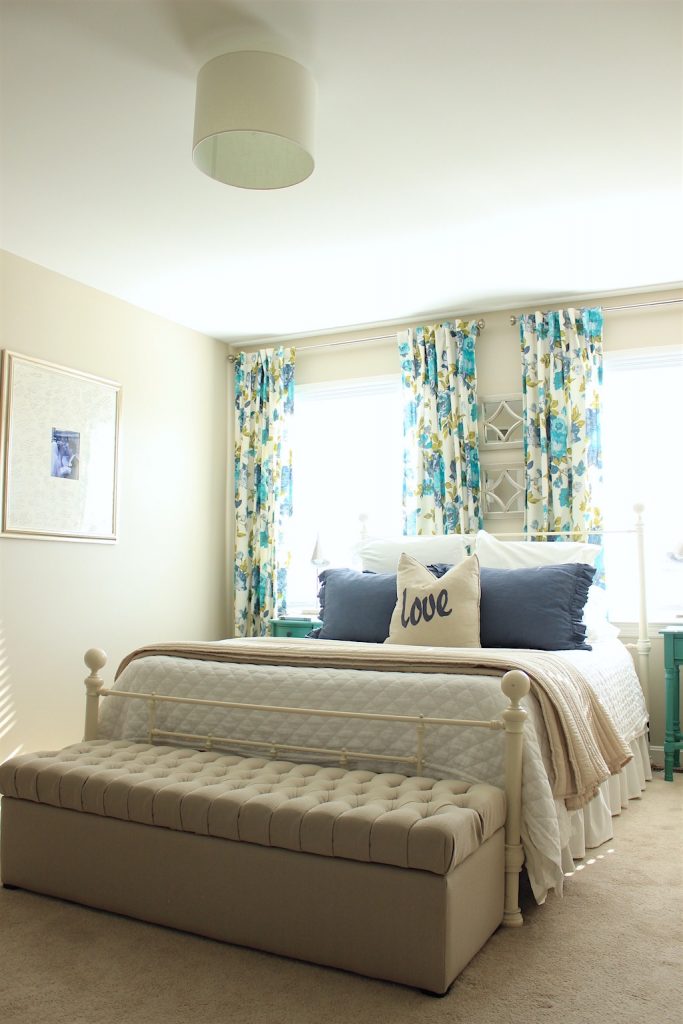
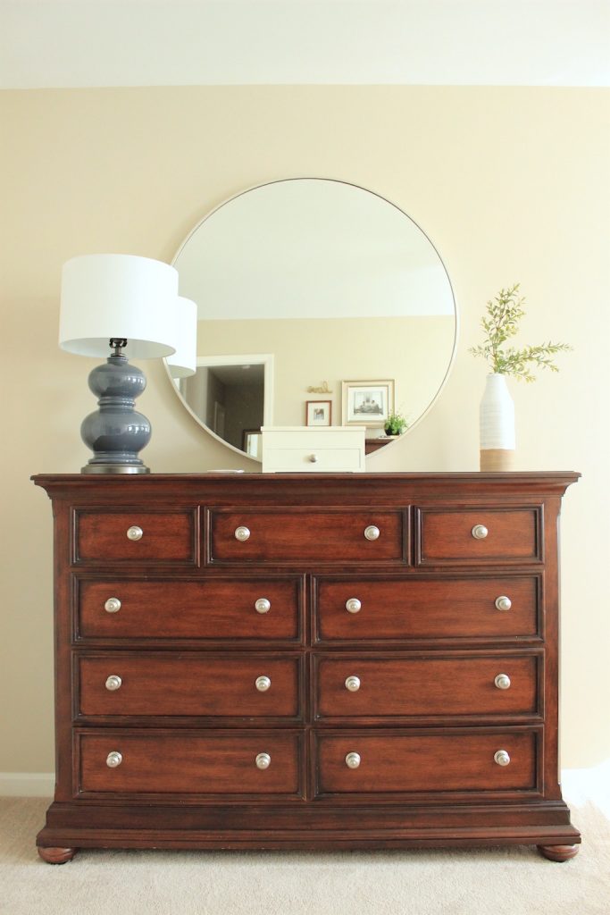

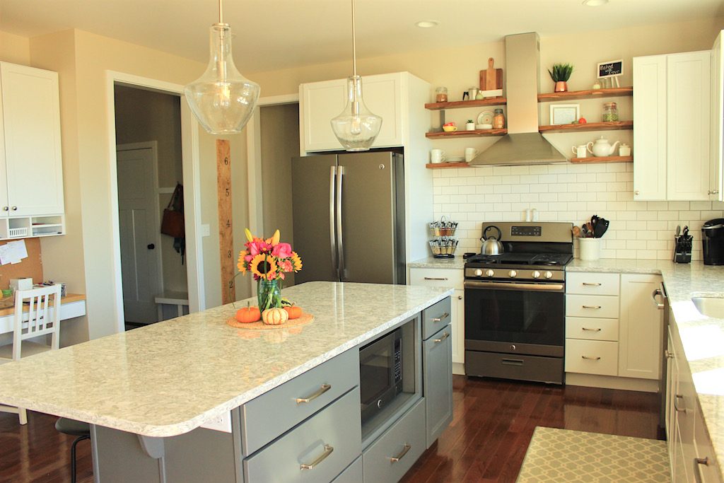
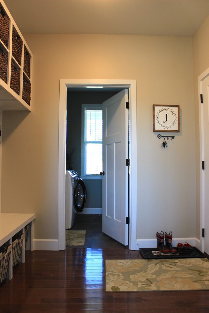
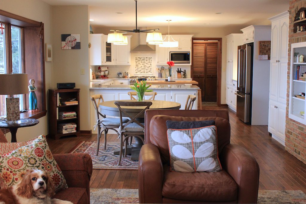
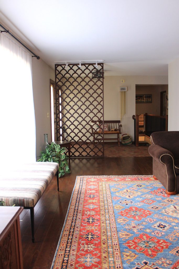
Lovely, isn’t it?! Now, I’m not saying that this color is guaranteed to work for you. I have certainly pulled it out in some homes where it did absolutely nothing for their rooms. But in the right places with the right complimentary colors, it can do wonders!
If you are local to central PA, planning a new build, renovation or just freshening up a room, read more about my consultations HERE.
As a side note, if you are planning to paint, I highly recommend ordering large painted swatches that you can hang and replace from Samplize. They have all the top paint brands and you typically have your swatches in hand the following day. These large samples made a world of difference in comparing and getting a better idea as to how each color will read in your space. You can check those out HERE.