It’s been a bit since I’ve been able to document and share a design project on here, so for those of you that enjoy some good before and afters, this is for you. In all honesty the ‘before’ of this renovation wasn’t awful, but it was certainly in need of some updating. We took it from one pretty white kitchen to a much more functional and updated, not to mention stunning, space.
Being the color specialist that I am, I have to add a disclaimer and mention that I wasn’t always able to capture the true colors (re: undertones) of the walls and tiling in every image due to the light and shadows playing games on this unprofessional-photographer. So you can just trust that I paid very close attention to the tile and existing wall color to make sure that they worked perfectly together. And in person it’s just beautiful.
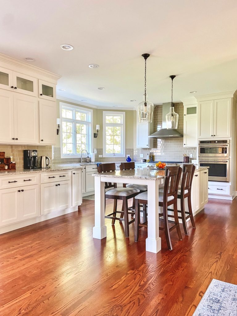
Since you already got a glimpse of the end result, let’s backtrack a bit and see where we began…
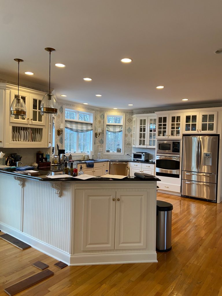
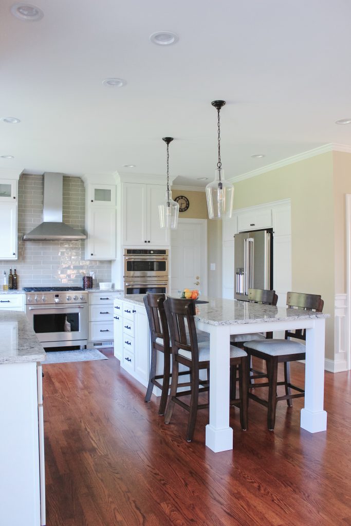
As I said, this wasn’t a horrific kitchen to say the least. But the odd shaped peninsula and lack of a true island was inhibiting this room from functioning to its fullest potential. Once they had a layout in mind, Steve Hackman Builders brought me on to the project to help pull all of the finishes together.
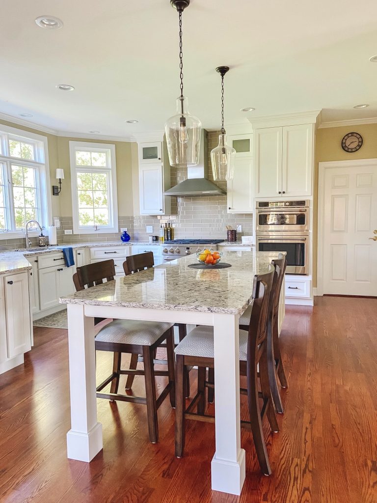
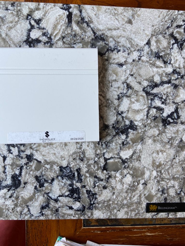
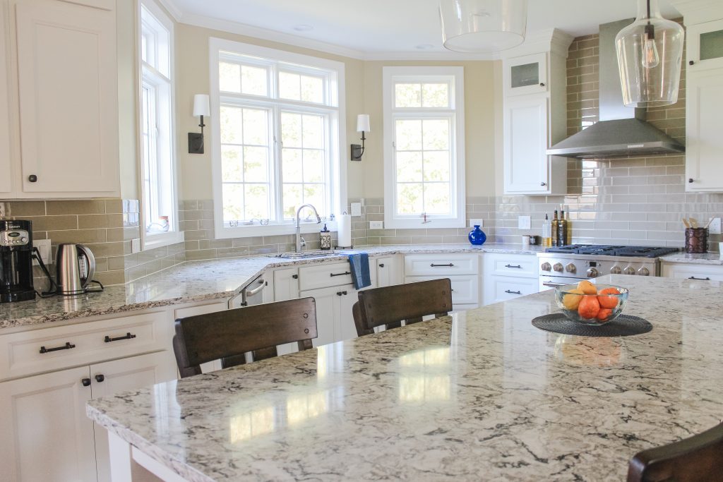
The homeowners are a fun couple that love to entertain, so a large island was a must for them. With room for prep work as well as seating, they now have a ton of functional space. They found a quartz counter that they both agreed on (this can be no small task) which worked well with the wall color (which wasn’t changing), so this became the element that dictated the rest of our selections in terms of color. SW Pure White, which is a slightly off-white, was the white that I selected to pair with the counters. And then you can see that the backsplash tile we selected pulls from the quartz as well. It’s as though it was all intentional ;)
The floors throughout the main level were sanded down and stained to a beautiful warm brown. Another element that updated the space while keeping with the classic and traditional style of the home.
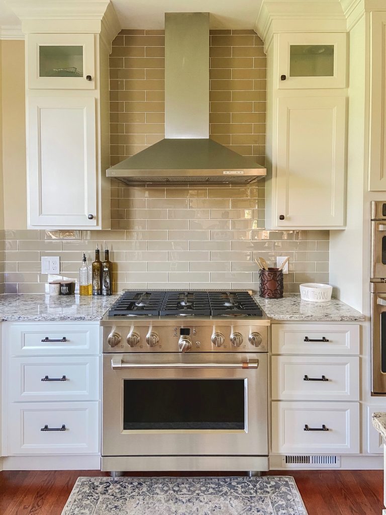
I love the glass subway tile that we landed on. We went back and forth on a few different options, but eventually decided that this one had a classic yet updated vibe that worked well with the rest of the home.
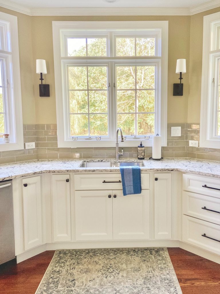
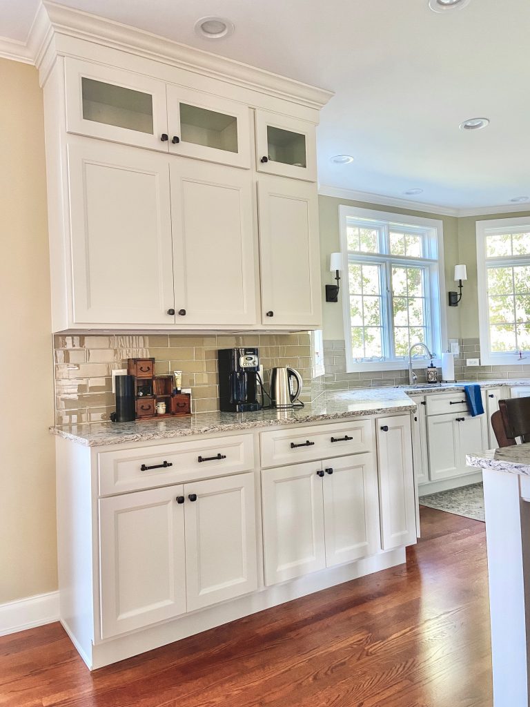
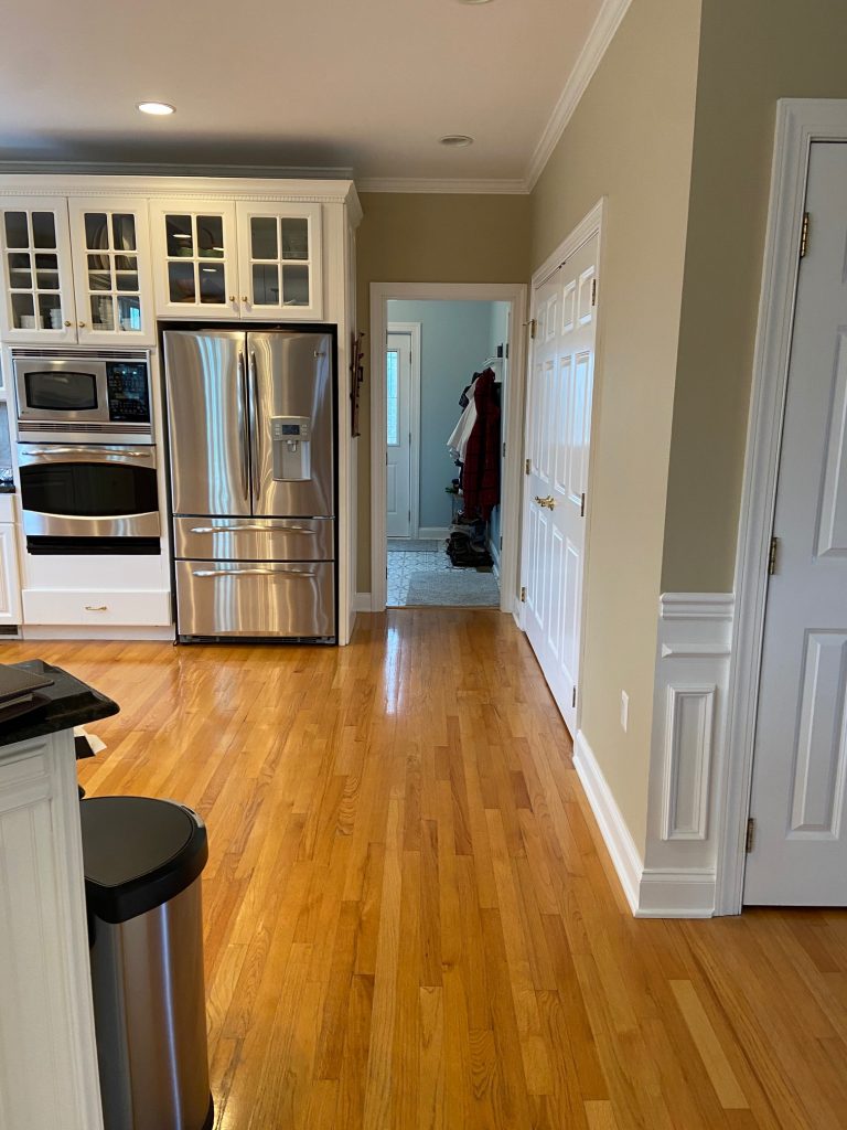
The windows are to die for and despite their large presence there is still more than enough cabinet space that the owners will never be lacking on storage! To ensure that, the cabinetry was taken to the ceiling to fill in the previous dust-collecting gap.
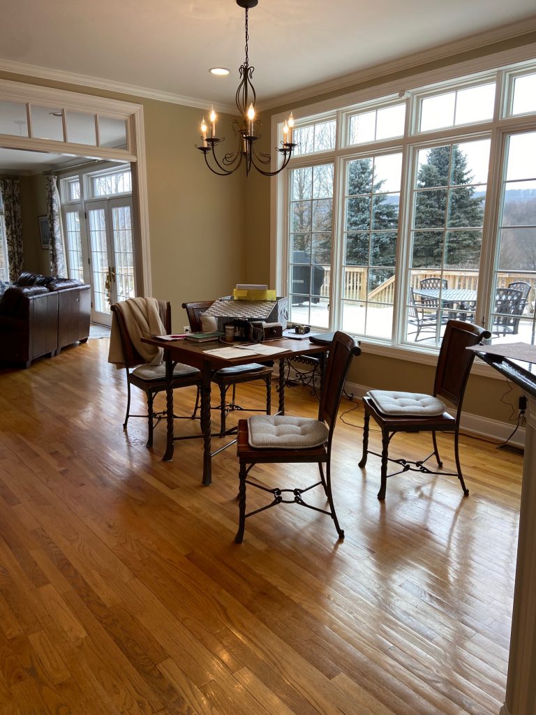
Here’s another look at the before…
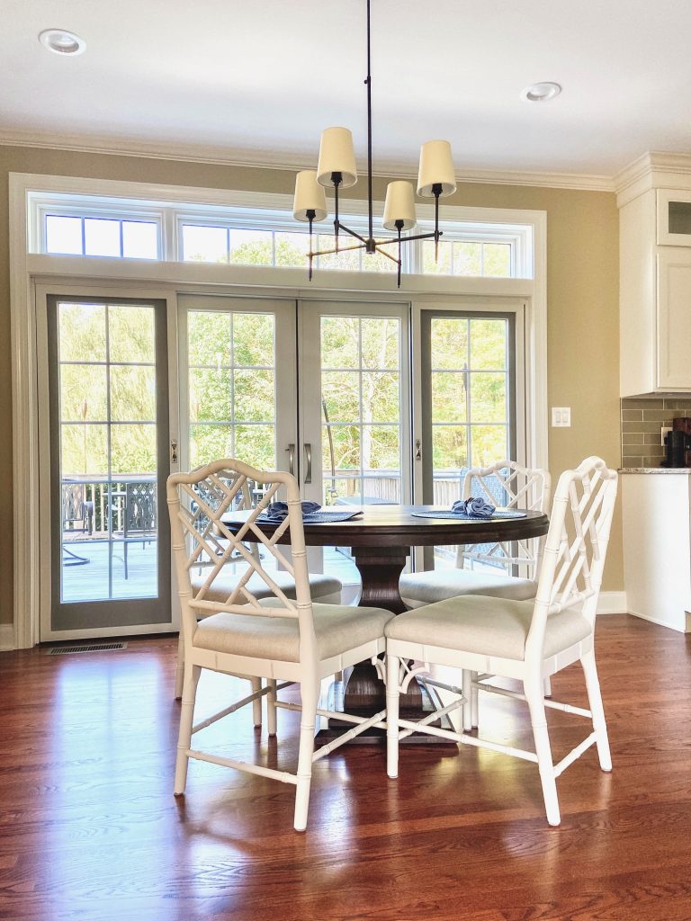
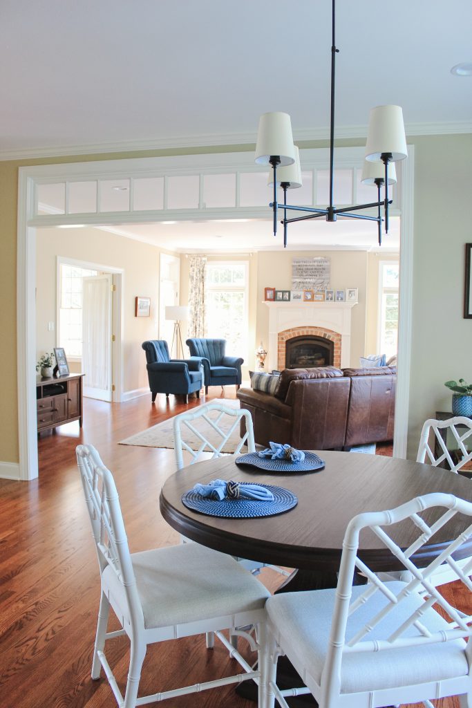
And then after…
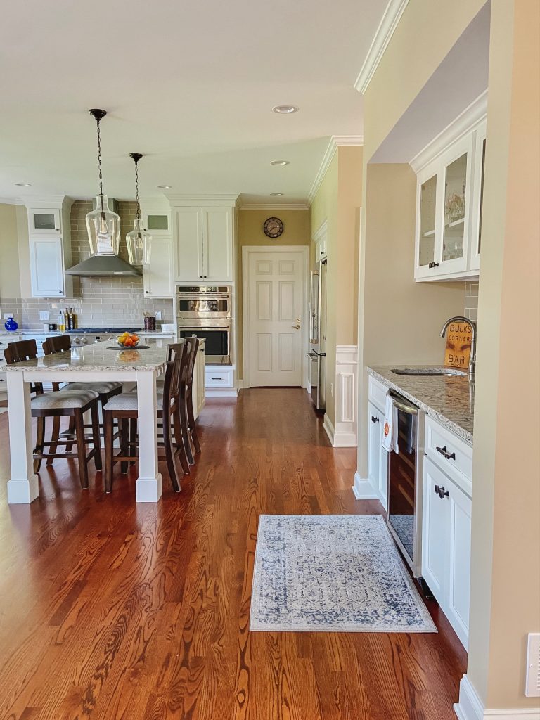
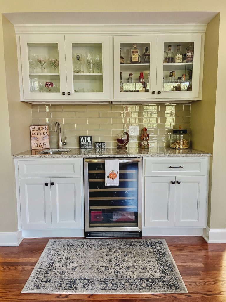
The fridge was relocated with pantry space surrounding it and by shifting some walls around (easy for me to say), a bar area was created. I’m telling you, it’s an entertainers dream! I wanted sizable pendants that would fit the scale of the room but we also didn’t want them to obstruct any views. These large glass pendants were the perfect compromise.
Just off of the kitchen is a dining area that was eager for a few updates as well.
The wall of windows above was replaced by a gorgeous set of sliding doors that continues to add to the functionality of the room, creating easy access to the deck. A new table, chairs and light fixture and this area is now magazine worthy.

I feel honored to have been able to be a part of this project, helping to bring a whole new life to a space that this couple will enjoy for years to come!
Sources:
Contractor: Steve Hackman Builders
Kitchen design/Installation: Shunk’s Kitchens
Counter: Cambria, Bellingham Quartz
Tile: Riva Glass in Beige
Pendants: Savoy House
Chandelier: Visual Comfort
Sconces: Generation Lighting
Table: Ballard Designs
Chairs: Ballard Designs
Cabinetry color: SW Pure White
Wall color: Color matched to existing wall color

Comments
I worked with Shunk’s Kitchens and had an excellent experience