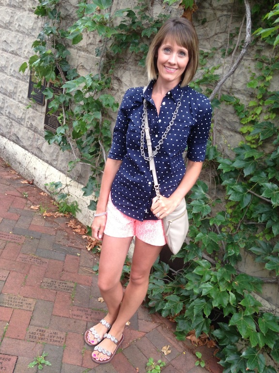
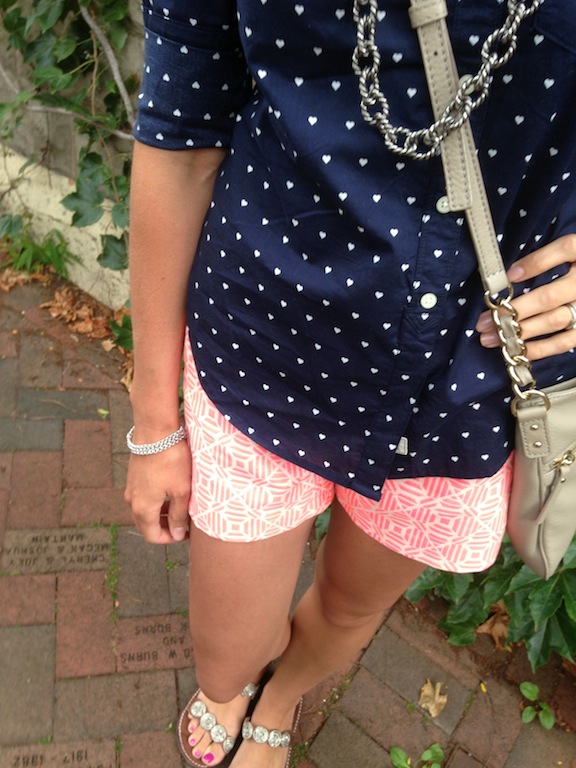
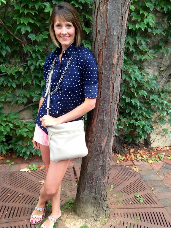
I love the idea of mixing prints and patterns. When I see it on others I always envy how effortless they make it look. “Oh, hey I just threw this on and I look perfectly pulled together”, ya know? JCrew is the king (queen?) of this, always pulling it off seamlessly. I think Jenna Lyons, their creative director, has played a big part in encouraging the printed pairings. Here she is wearing a striped top and floral pants. Effortless. Well I decided to give it a shot. At first I was going to pair this top with my solid bright green shorts, but then I saw my pink graphic shorts and the lightbulb went off (not literally). Although both pieces are Gap and not JCrew, I think I managed to pull off a bold yet slightly reckless look. And for those of you who know me, reckless is slightly out of my element :)
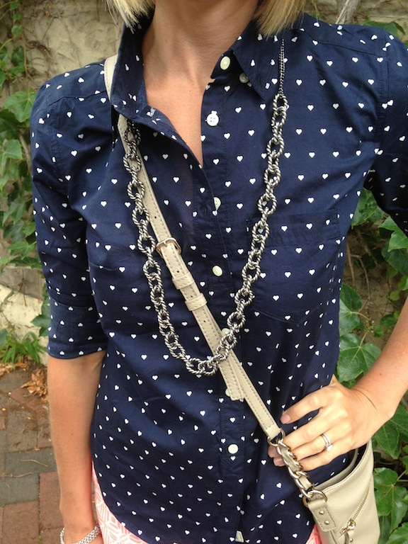
I kept my accessories a solid silver as to not push the “recklessness” over the edge.
Out of my element, but I enjoyed it and will probably try it again!
Gap shirt, Gap shorts (similar), Anthropologie sandals (old), Kate Spade bag, Target necklace
What do you think? Have you mixed prints? Would you try it?


Comments
Love!
I clicked on your picture and was like “I have that shirt! It’s from the Gap!” BUT mine is just regular polka dots. Are those hearts? SUPER cute. Great Target find as well. I love the whole ensemble :)
Yes, they’re hearts! And it’s on stores now. And it’s currently friends and family ;)