I don’t know where you fall in terms of home projects right now. When the quarantine initially began, I found myself tackling small projects around the house, like cleaning out drawers and reorganizing our pantry shelves. Then we did a big deep, spring clean throughout the house. We also began tackling some of the annual outdoor spring tasks, cleaning up the yard and landscaping. As the weeks have been rolling on, I figured we may as well jump on to some other projects that had previously been on the back burner. Like painting.
Our hall bath had paint that was chipping and peeling away around the shower (my kids like their showers toasty!), so although I wasn’t necessarily changing it because of the color, it was more out of necessity.
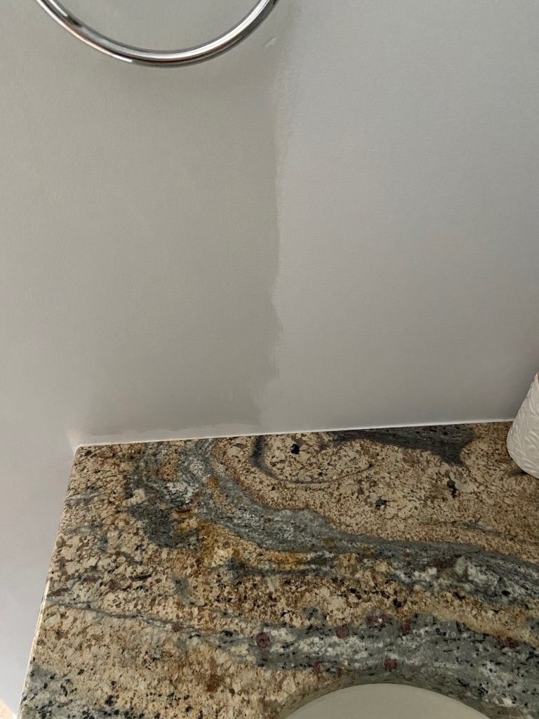
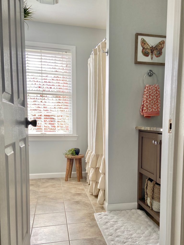
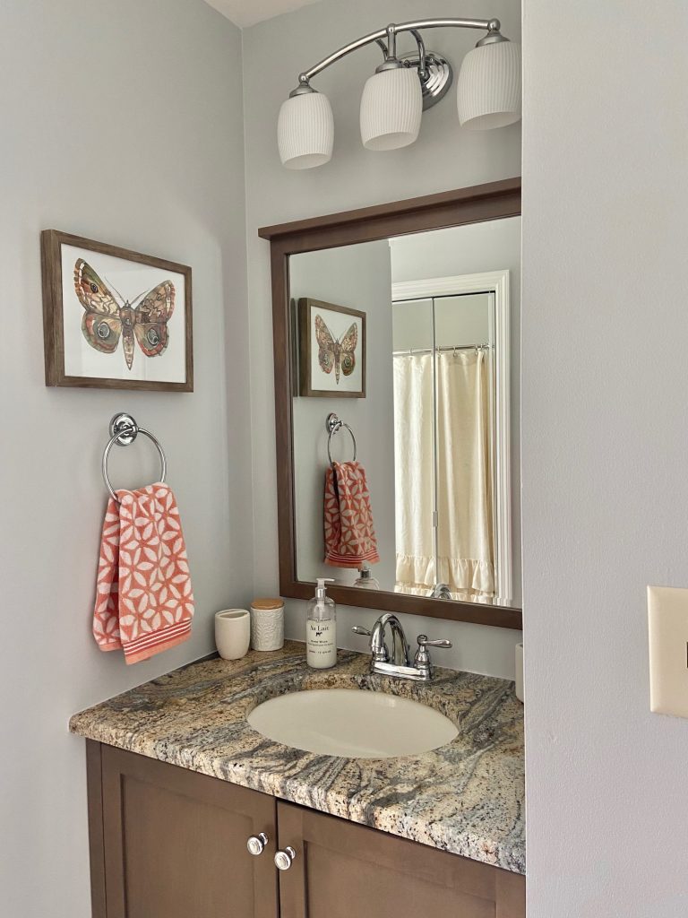
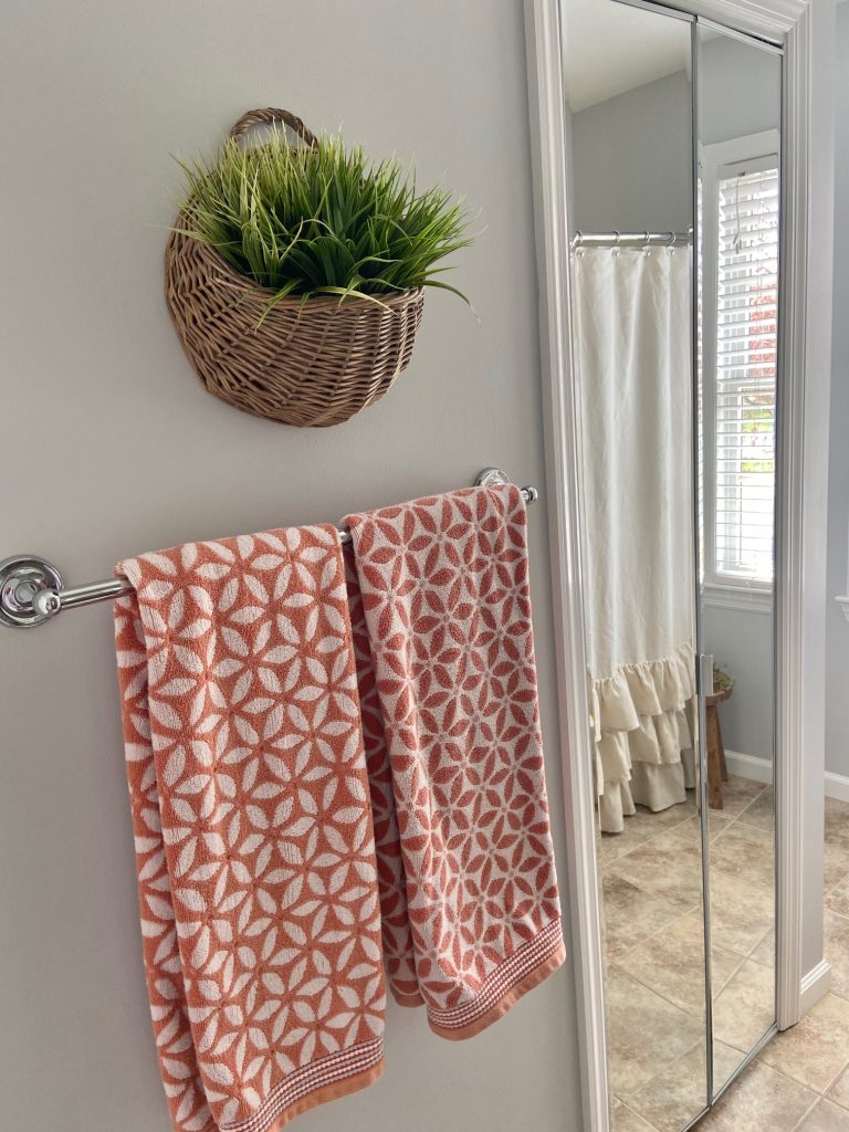
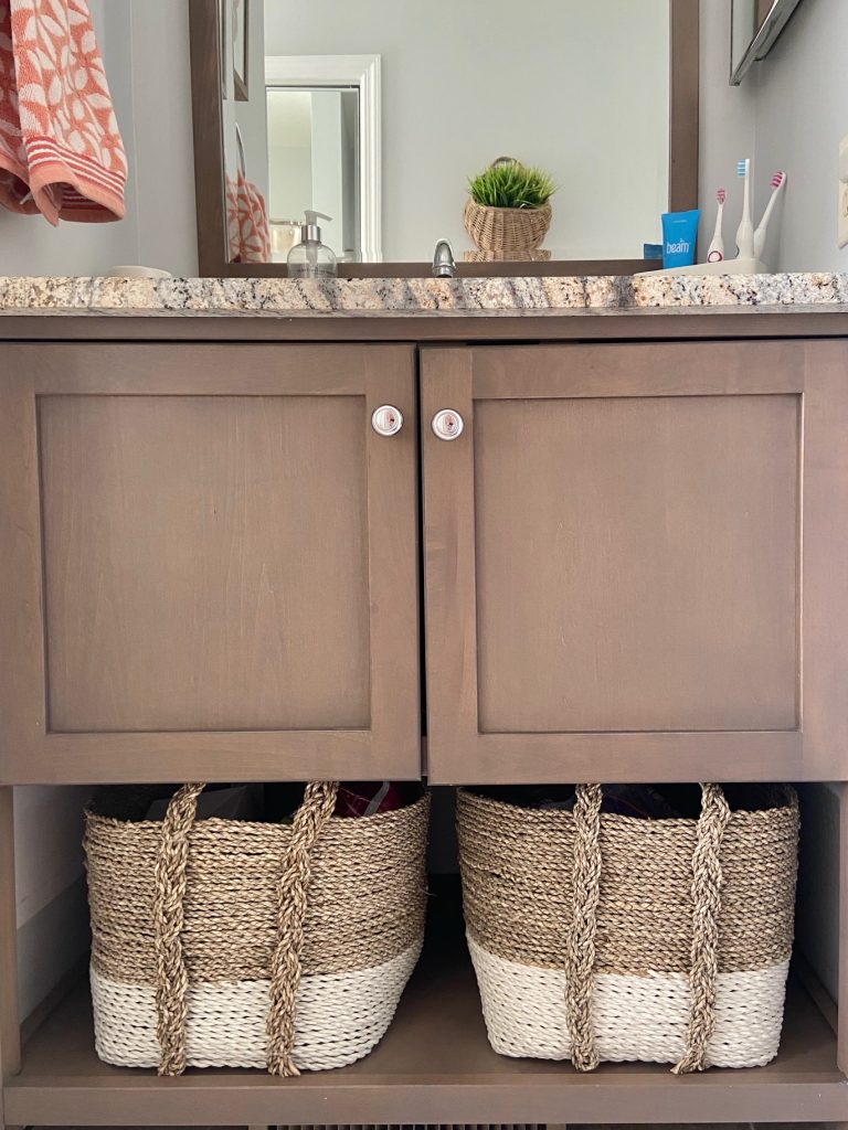
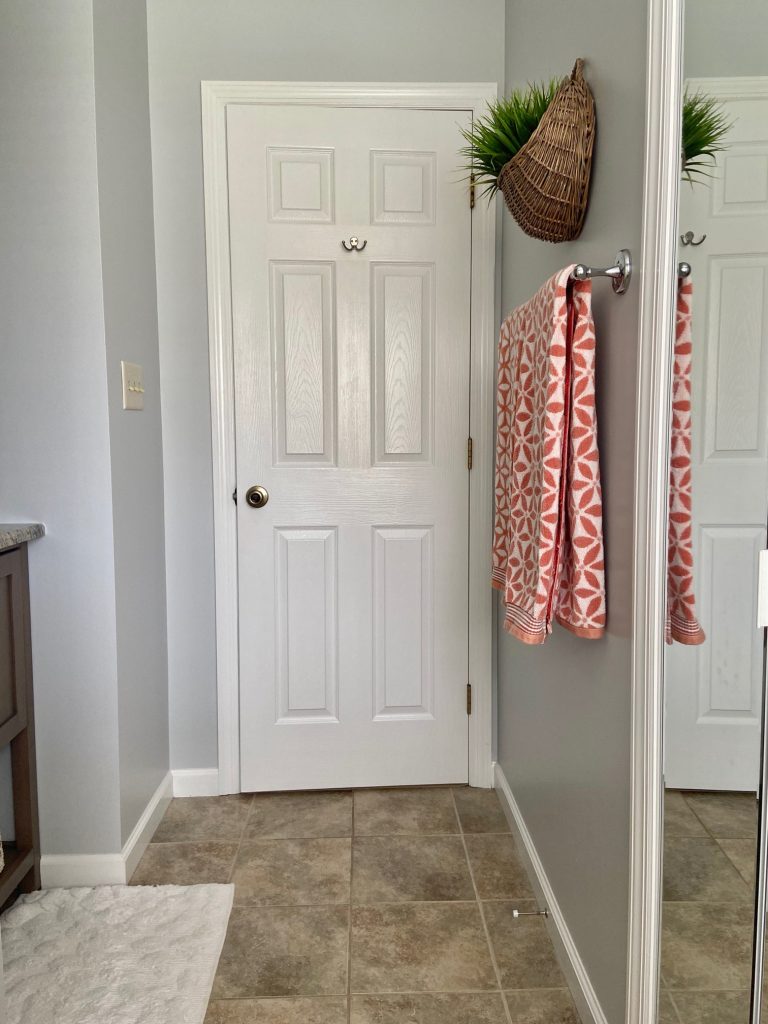
To the right you can see the old color. A soft, pretty, barely there light blue. It related well to the countertop and I didn’t have any problem with it. But since we were going to paint, I figured we may as well give it a change. I first thought about going very neutral to switch things up, but that left for a very boring palette. I ultimately decided to stick with a similar shade but took it a little richer. I still worked off of our countertop (which is the bossy element in that room), and pulled out a beautiful blue grey.
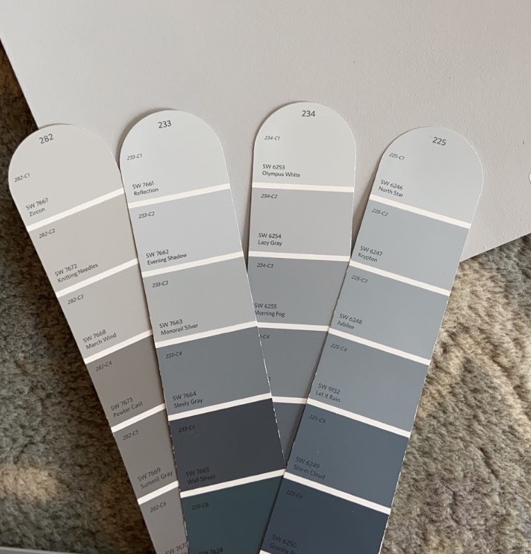
The top row above were the colors I had narrowed down. Zircon would have been a bit too gray, North Star a bit too blue, Olympus White not quite enough tint to it, so Sherwin Williams Reflection is the one that hit the mark.

You saw from above that I obviously sampled the color, because trust me, these miniature swatches can be deceiving!
My recommendation when sampling your color is to paint a large sample onto white cardboard or heavy cardstock leaving three edges with a white border and painting to the very edge on the fourth side. This will allow you to move it to various areas of your room (regardless of what space you’re talking about) while holding it up to windows, counters, furniture, etc. This will help to eliminate your current wall color from influencing the color you’re sampling. Basically, don’t do what I did above ;)
Thankfully Sherwin Williams is offering curbside pickup, so a quick phone order in and we had everything we needed to tackle the room.
I’ve been asked how we tackle these projects because yes, the whole painting process can be daunting. Thankfully, Jack is always open to these projects (we’ve painted almost every room in our home ourselves), and we balance each other out with the work. Prep work is key and Jack is very diligent in that regard. Remove everything you can, sand and spackle when necessary and cover your floors and other surfaces. He masks and trims and I handle all of the rolling. It’s quite therapeutic. We always make sure to paint two coats, even with good paint (we use Sherwin Williams Duration line) we still find we are happier when two coats are applied.
You can see in the image above how the blue/grey also relates to the floor tile, pulling out the grey amongst the other taupes and pink beiges.
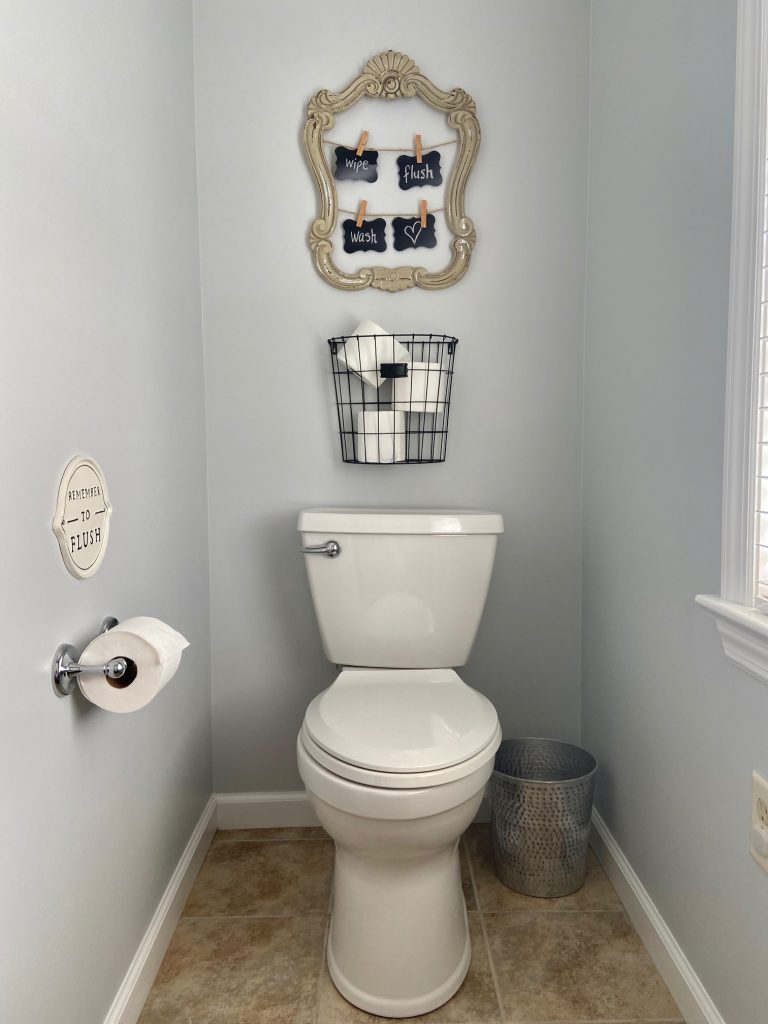
I didn’t change out any decor at this time, so everything in there is what we previously had. I’ll do my best to link both exact and/or similar items for you below.
I’d love to hear about what projects you’re all getting yourselves into lately! And if you’re struggling with wrapping your head around the perfect paint color, make sure you reach out (via the Paint Consulting tab at the top of the page) so we can discuss your needs.
Shop the Room:


Comments
I love your color choice for the walls. It plays very nicely with the brown and beiges in the granite. I am curious what color you painted the cabinets? That brown is outstanding!
Hi Dawn! They were actually stained before we moved in so I’m not sure of their exact color.
I’m wondering where you found the wall basket for plants? The room is lovely
Thanks Sarah! I found it locally but have a similar one linked above for you!
What color trim would you recommend using with Reflection?
Most true whites or slightly off-whites would work perfectly well.
Love this bathroom. Where did you find the beautiful towels?
Thank you! They are from Target a few years ago.
Thank you for sharing your experience. It is very informative. My kitchen cupboard are painted SW reflection and wondering what can go with the wall. Any suggestions is much appreciated.
Love your bathroom and used the same color for mine. Now looking for art to work with.
Where did you get the butterfly picture? I like the muted colors. If you don’t mind me asking.
I believe that was a Target find!