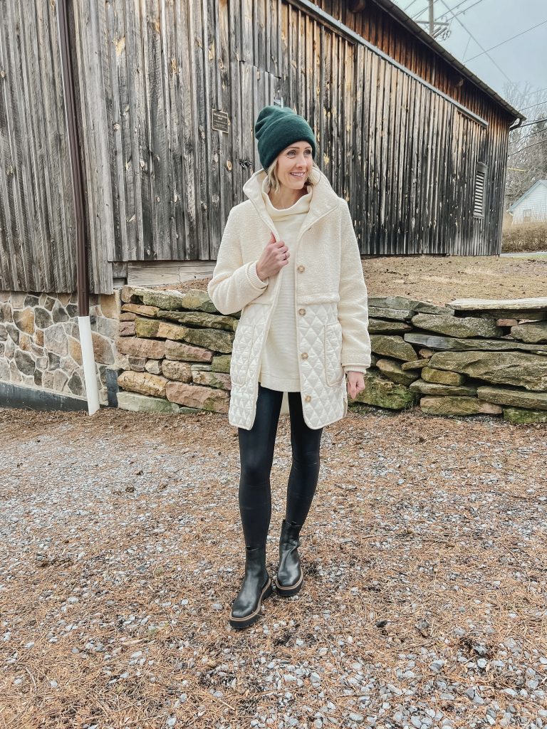
I love a good winter white look and this coat makes it easy to pull off! I pulled a few of my winter staples out which included this tunic sweater, faux leather leggings and chelsea boots. This sweater is a favorite of mine (I also have it in pink and green). It’s such an easy go-to that you can wear just about anywhere. If you like the style but don’t want to pay the price tag, you can find a great dupe here. Faux leather leggings are another favorite of mine as they instantly elevate any look! This coat is one I’ve had my eye on all season but I didn’t end up purchasing until it went on sale. It was perfect timing however as it’s not an overly bulky/heavy winter coat, so it’ll be great for the late winter months leading into spring, especially if you’re in the northeast as I am.
Today I’m sharing a small update that I recently made to our living room. In our home, our office (which you saw here) is dedicated to my husband who works full-time from home. I work from my laptop which follows me from room to room to meetings to coffee shops. I love the flexibility that I have, but I was in need of a dedicated work area to at least serve as a landing spot.
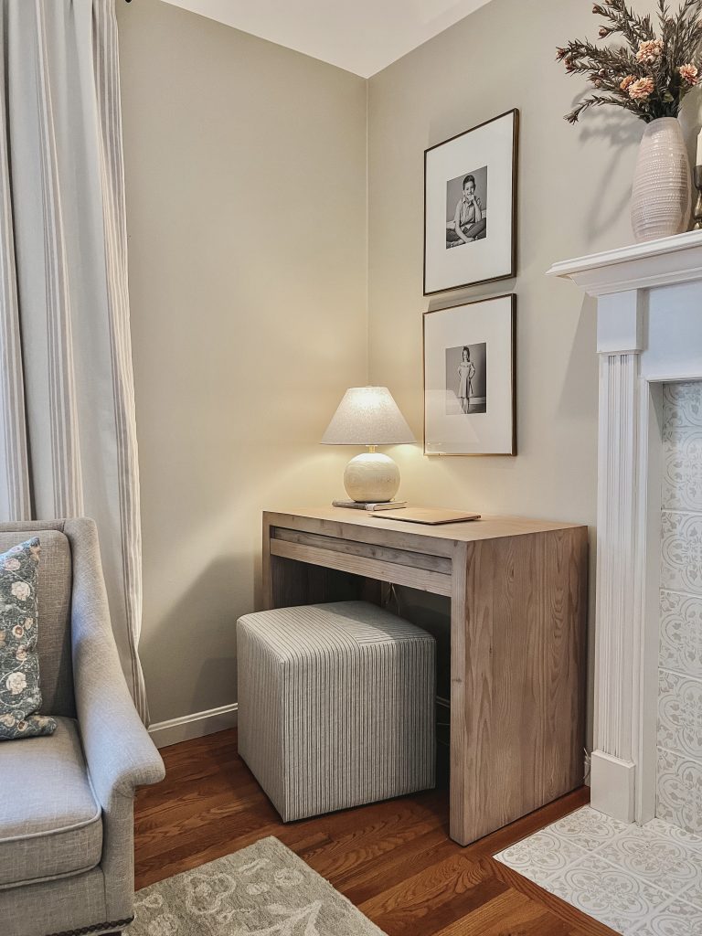
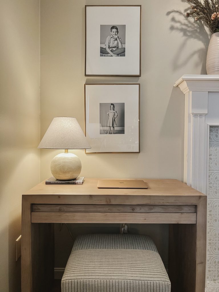
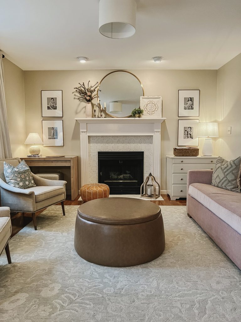
Our living room, which is just off of our kitchen, had an empty corner that previously only provided a home for a standing lamp. I have a chest of drawers on the right hand side of our fireplace and after having a light bulb moment when I saw someone on Instagram place a desk in an otherwise empty nook, I realized how perfectly I could fit a small writing desk in our opposing corner.
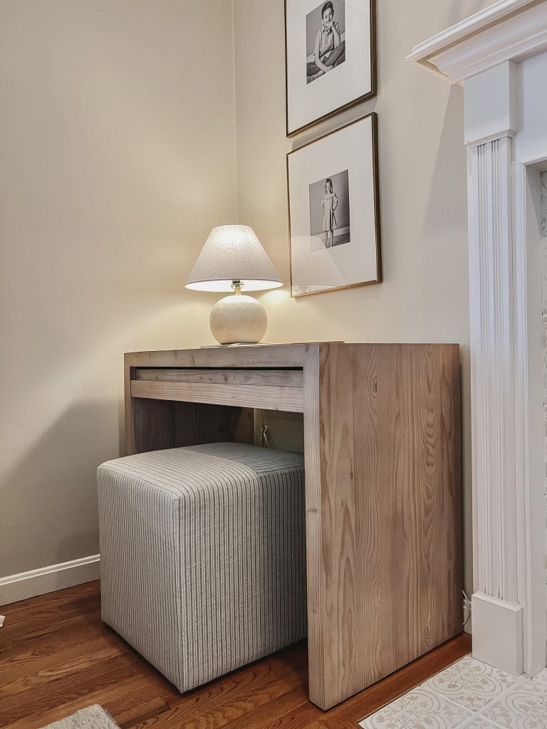
It had to be a very specific size, which actually wasn’t all that difficult to track down. I wanted something simple, yet a piece that would make a subtle statement. Pottery Barn’s Folsom Writing Desk is the one that I settled on. It checked all of my boxes perfectly and balanced out the room as a result.
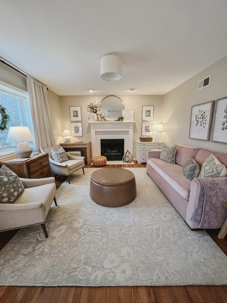
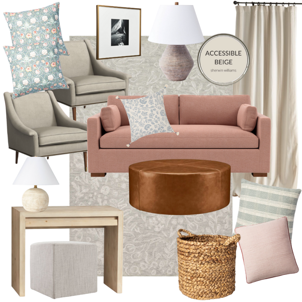
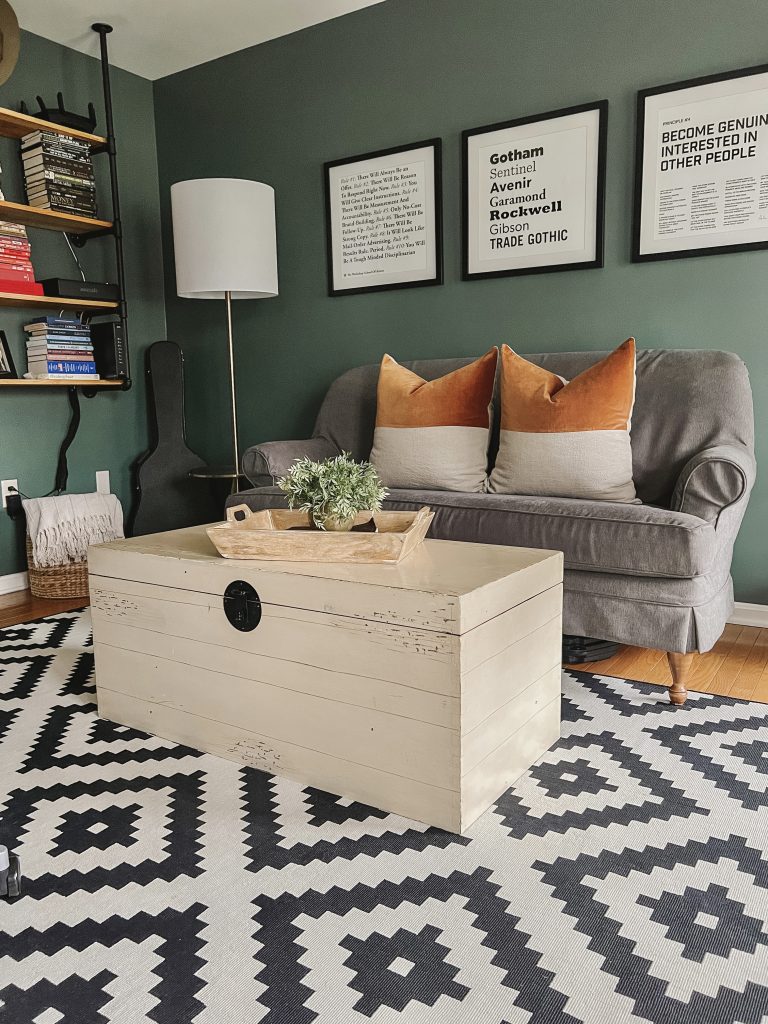
Here’s a look at a design board I created. It includes exact and similar pieces in our living room which I will link below. Our ‘rose’ colored sleeper sofa came from Interior Define. It’s their Charley sofa that you can find here. I frequently get asked about our wall color which is SW Accessible Beige. It’s a beautiful color that brings a nice amount of warmth to our room. Our ottoman and wall art came from HomeGoods and our chairs were a score at the Anthropologie Home Outlet (locals, their outlet is in Pittsburgh!).
Without a doubt, my girls will be taking over this work area with all of their arts and crafts, and maybe a little homework here and there! A chair would have been a bit too obtrusive in the corner, so I opted for this upholstered cube instead. It’s discrete yet comfortable and tucks under the desk perfectly.
I feel like that corner now has a presence instead of just disappearing. I love rethinking rooms and areas of our home in order to make the best use of our spaces. With three growing kids we need to make the most of it all!
I’m linking as many exact pieces from our room as I am able. I’m also including similar pieces at a variety of price points as alternatives.
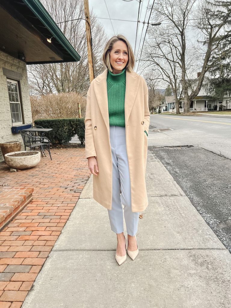
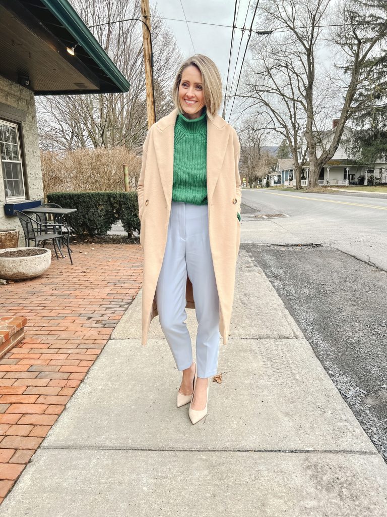
I stopped in Loft the other day to see what was new in store and found some really great pieces! I tried a little bit of lounge, a lot of cute tops and a couple of bottoms to balance things out. Everything I’ve shared is currently either 30-40% off at the moment, so it’s a great time to grab some new things if you’re in need. Most pieces ran true to size for me. For reference I’m 5’7″, wearing a small in most everything unless otherwise noted.
I love these bright and playful cardigans. They’re perfect for the winter weather but will transition well into spring as well. You could easily pair these with some colorful pants for a bolder look and wear the cardigans layered over a cami or button-up for some versatility in looks.
Always nailing it on the cute matching sets, these Lou and Gray combos and so cute and so comfy. Sizing varied a bit for me with these pieces. Their bottoms tend to run a little big, so I’m in xs in both bottoms here. The navy set I’m wearing a small in the top, but an xs in the off-white as it ran pretty large.
Love this top alone or as a layering piece under a cardigan (this red cardigan or this sweater blazer would be cute for Valentine’s day). I don’t always have luck with their denim, but these were a pretty good fit for me and I loved the kick crop fit.
I loved these lighter weight sweaters as well. I definitely fell for the ruffled collar and the green detail on the first one! And this ribbed wrap sweater was so pretty and also came in a few other great color ways. Both would make great options for work with trousers or weekend with denim.
I loved this oversized shirt. It’s a piece that can be worn any number of ways and is very functional, for my own closet at least. I paired it with my wide-leg denim that I had worn that day and wore the shirt open over a bodysuit to show a waist-line when worn this way. I also tried it on with a pair of their slim leg flared pants for another look….
I like how the slim leg balances out the look when paired with an oversized top. I needed to size down one from my norlam in these pants for the best fit (which they unfortunately didn’t have in store for me).
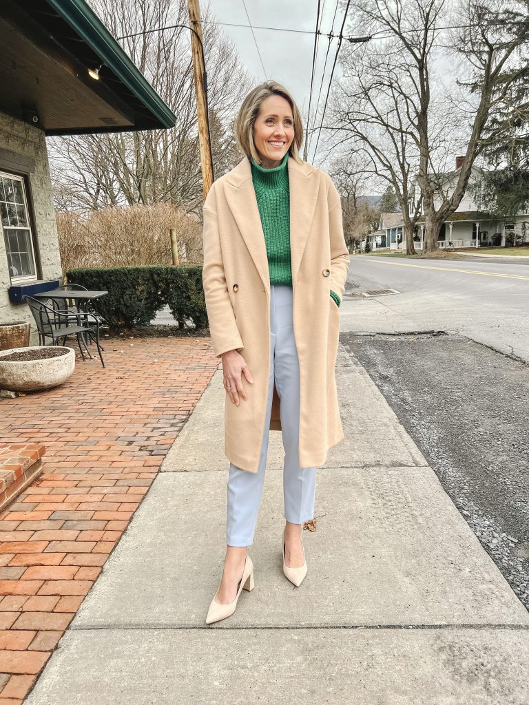
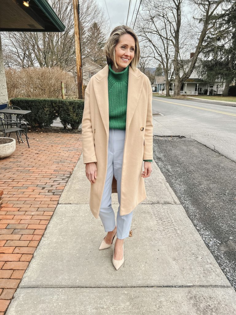
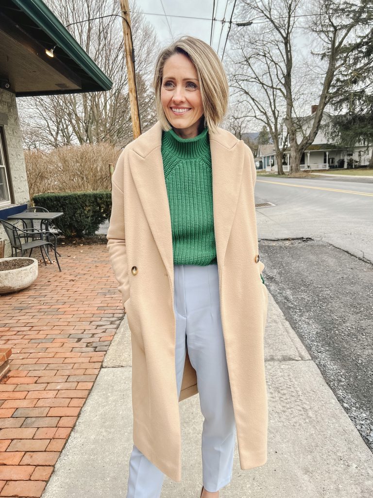
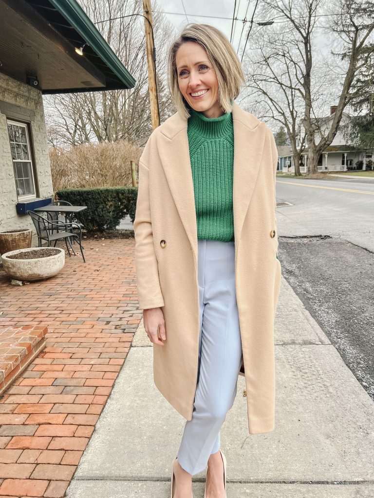
Dreary weather calls for cheerful outfits! We can’t control Mother Nature, but we can at least have a hand in our closet. I picked up this sweater in store a few weeks ago and adore the classic roll neck. I loved the more subtle shades of light pink, camel, black and linen, but I couldn’t pass up this bright and cheerful green. I don’t know why my first instinct is to tone down a color by pairing it with denim, black, navy or even camel bottoms. Not that there’s anything wrong with that by any means, but I took a que from the way they had styled this on the website and pulled out my blue and pink pants to try on with it. Both were great options, but I settled on blue this time around. I obviously then played it safe with a camel overcoat, but I love how this look ultimately came together. I’m going to put more focus on pairing more color with color this year and gradually step out of my typical go-to’s. Some of these pieces are no longer available but I did some digging and found some more options for you in case you wanted to create a similar look and didn’t already have something in your closet.
‘Tis the season for home refreshes! This is my first post of 2023 and I’m feeling inspired and ready to freshen things up around our house as I’m sure many of you are too. My color consulting business typically comes to a crawl towards the end of the year as everyone settles in and decorates for the holidays, but come the start of the new year everything vamps back up! Once those decorations find their way back to their bins it’s as though we have a fresh set of eyes to view our home with. Sometimes this calls for organization or purging in certain areas, sometimes furniture gets rearranged and sometimes a fresh coat of paint is in order.
I have a bit of all of the above happening around here. It’s as though removing the ‘clutter’ helps me to rethink and refocus on how I want every space to look and function. The atmosphere within our home weighs heavily on how I function personally. I don’t thrive amidst clutter and chaos. I encourage my kids (my artsy girls especially) to return things to their places once they finish an activity. That’s a work in progress.
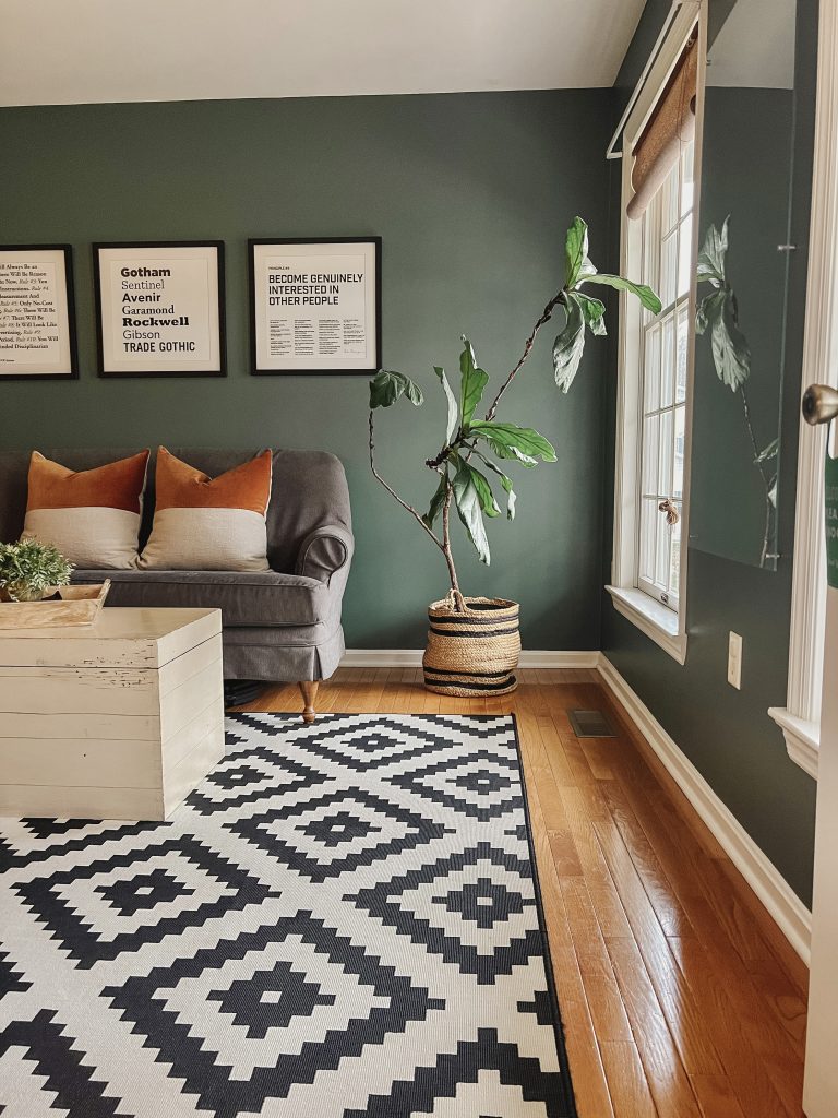
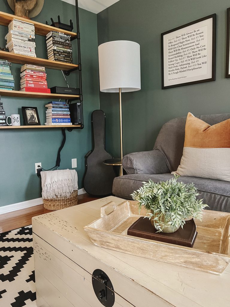
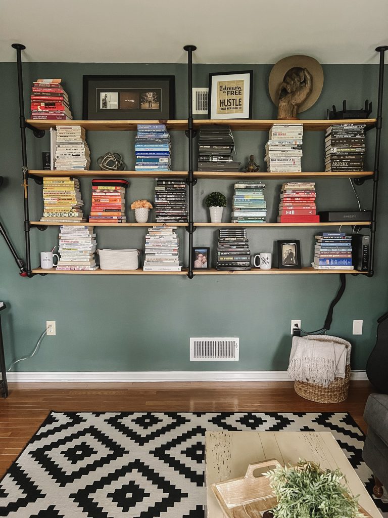
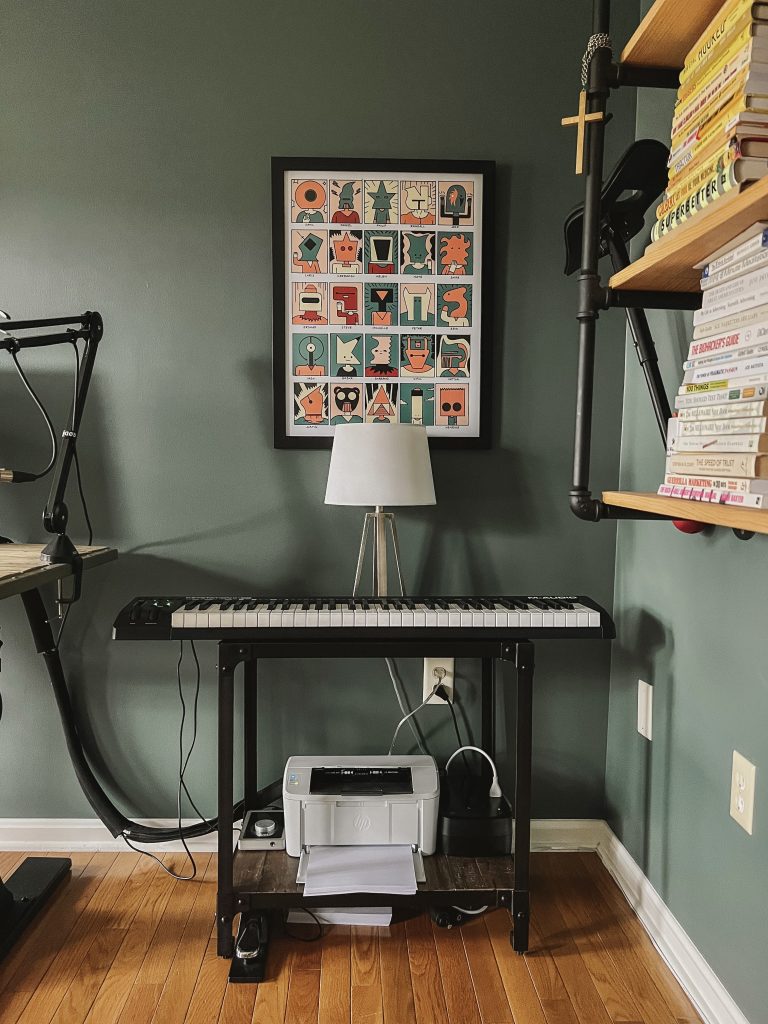
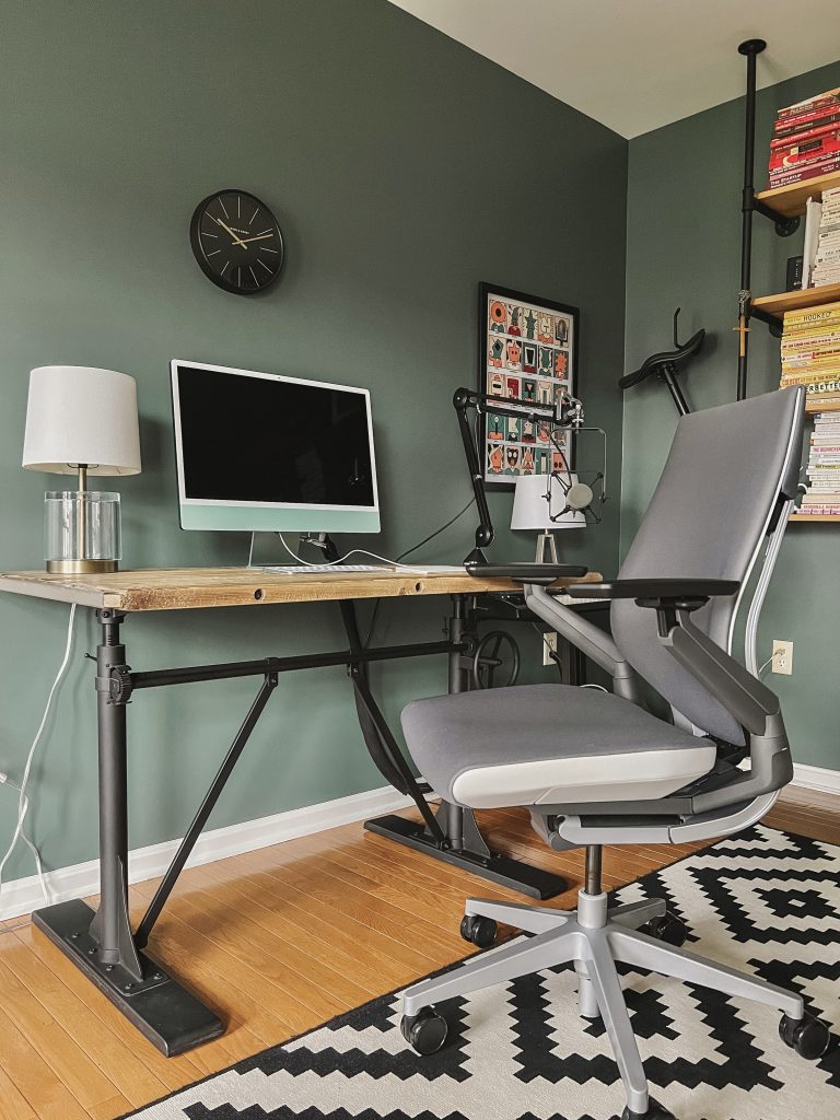
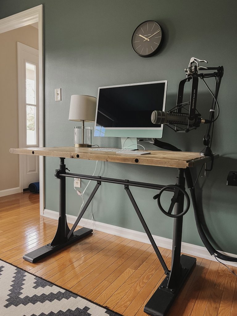
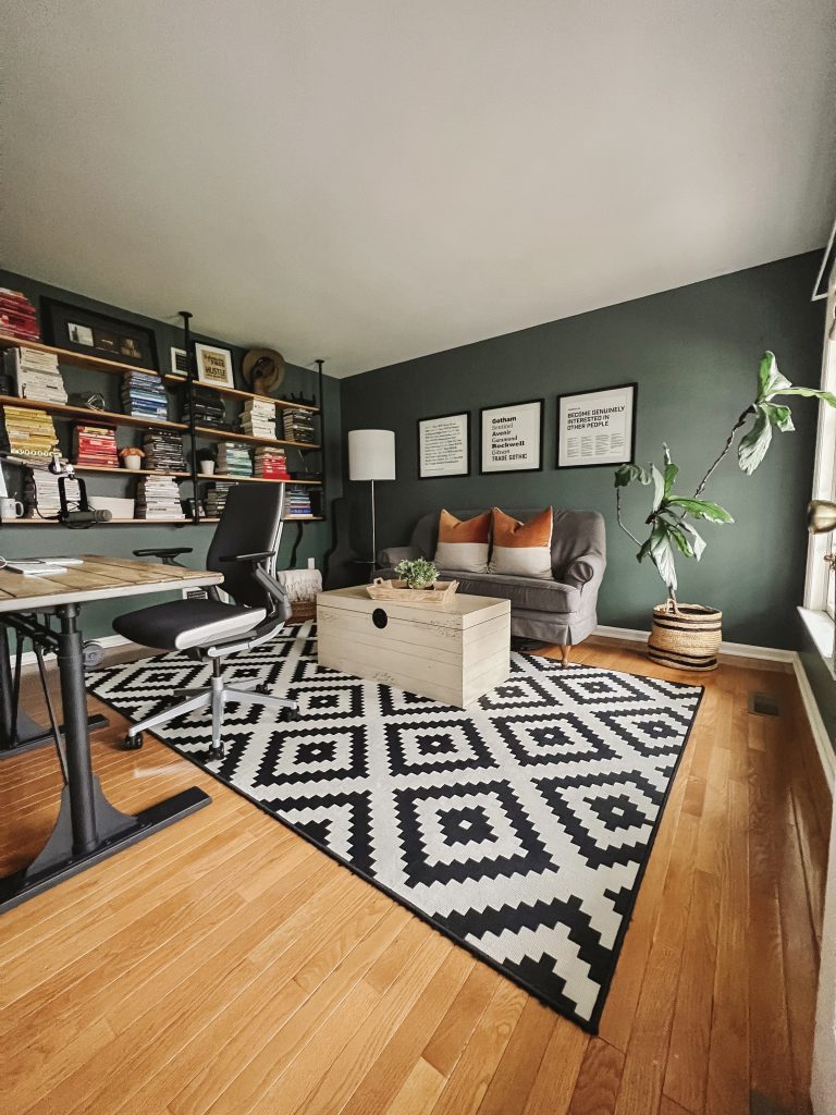
Decor and color schemes also play a major role in how we feel in a space. At the end of last year, both Jack and I had been itching to make some changes to his home office. When we first moved into our home over seven years ago, we painted the walls a white that had a touch of greige. Paired with the bold rug, industrial shelves (that he made) and brightly colored books, it was bright and crisp. It worked well until we both tired of it and decided to take a completely different direction with a much bolder color selection.
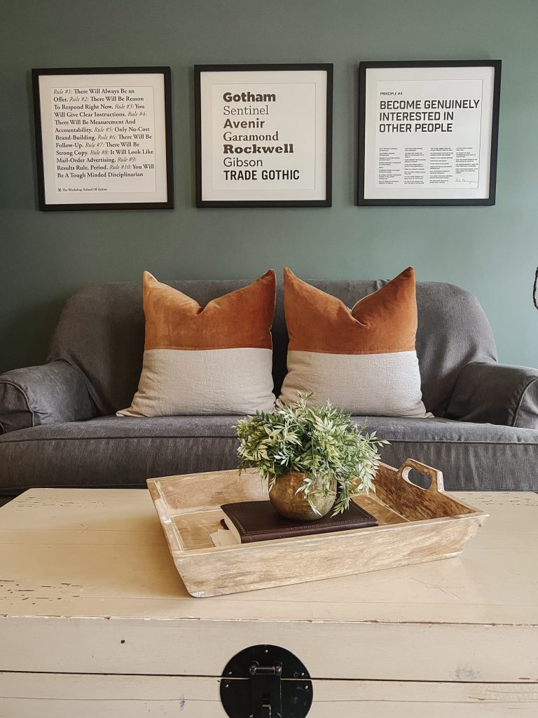
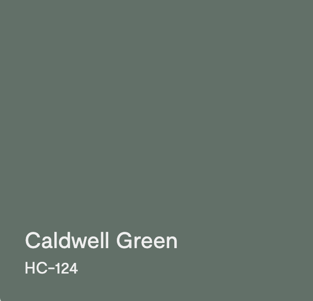
Although most of our home is fairly neutral, Ben Moore’s Caldwell Green is a color that I’ve always wanted to use. It’s a beautiful shade with a touch of blue which keeps it from feeling like forest green. I wasn’t sure where I could use it until it struck me how perfectly it would work in the office. Jack puts a lot of trust in me and my color specifications and he didn’t hesitate when I made the suggestion.
It took a solid three coats of paint but we were both thrilled with the end result. It feels moody yet sophisticated which was confirmed when Jack told me he felt like he was walking into a swanky hotel lounge. I swapped out a few other key pieces to really update the space and pull everything together. I found these pillows at Crate and Barrel and this standing lamp at Target. I love how beautifully the brass accents compliment the wall color.
Jack designed all of the wall art himself and he had a vision for the way he wanted his bookshelves styled. The color blocked arrangements of his books add a playful element to the room that’s nothing less than eye catching.
In typical fashion, Jack is always jumping from one project to the next. It’s not rare to hear him breaking out in song on the keyboard when he needs a bit of a reset. With this setup everything is easily at his fingertips.
This desk is one of the most practical pieces in his office. With the turn of a knob it easily converts from a sitting to a standing desk which he utilizes fairly often. Not to mention it has that industrial look that’s very appealing to him.
We couldn’t be happier with how BM Caldwell Green transformed this office and I’m thrilled to have another happy client! Although Jack is the one that gets to enjoy this space daily, being right off of our front entry it’s a room that offers beautiful visual appeal to all who enter our home.