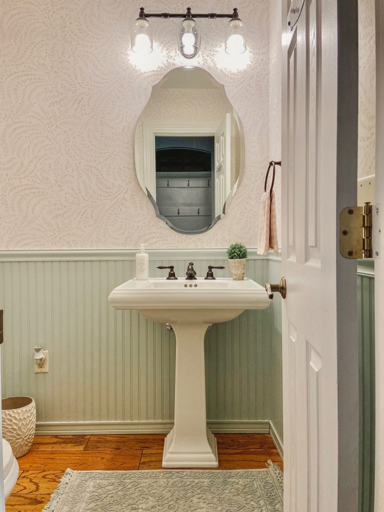
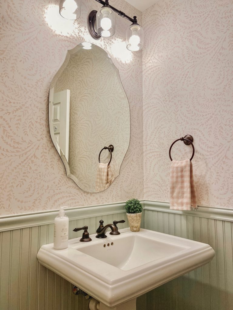
Today I’m sharing some pictures of our powder room that we updated towards the end of last year. I never got around to documenting it on here, but I couldn’t be more pleased with how it turned out! I love wallpaper and have helped clients select variations for their homes, but in my own home I tend to have commitment issues. I wanted something that flowed with our home, made an impact but wasn’t too bold and had an overall timeless appeal. Powder rooms tend to be a good place to play around with design. They are small but have a lot of traffic so everyone gets to enjoy your creative selections!
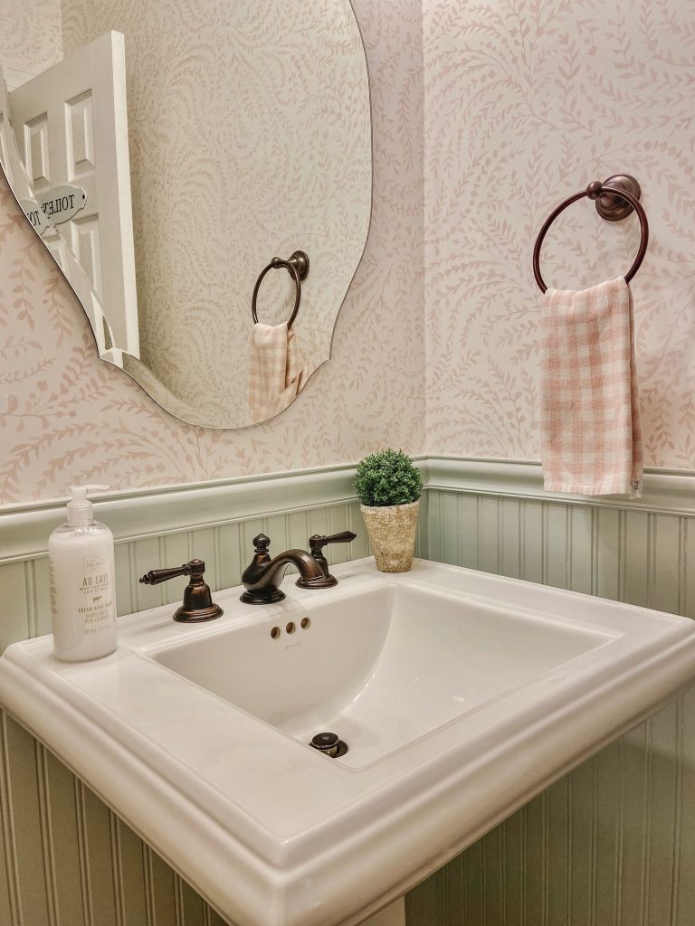
Serena and Lily’s Priano wallpaper is what I finally settled on and I couldn’t love it more. Previously we had Sherwin Williams Sea Salt on our walls with the wainscoting being white. I was hoping to be able to keep Sea Salt as a part of the new design which is what ultimately led me to pair it with this wallpaper in ‘pink sand’ which worked beautifully together. Sea Salt has a soft, spa-like vibe to it which makes it a very popular bathroom go-to color and one that I specify often for clients.
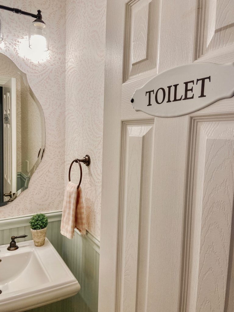
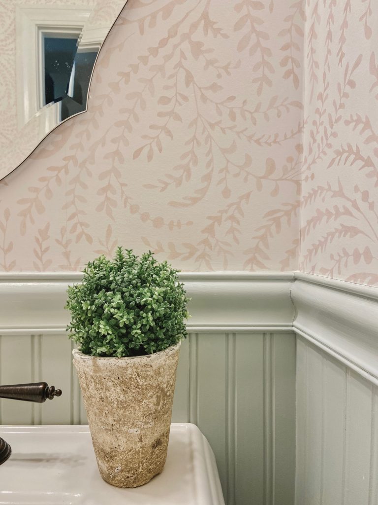
Since wallpaper cannot be changed out as easily as paint, I knew I wanted a rather timeless look that I wouldn’t tire of easily and this combination did it for me. Outside of the paint and wallpaper, we changed out our previously framed mirror for one that wouldn’t take away from the wallpaper. I love the elegant shape of this beveled mirror that we selected.
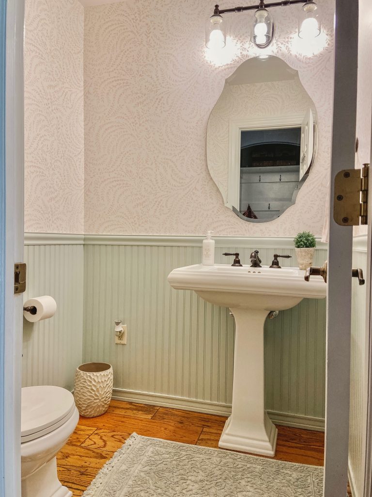
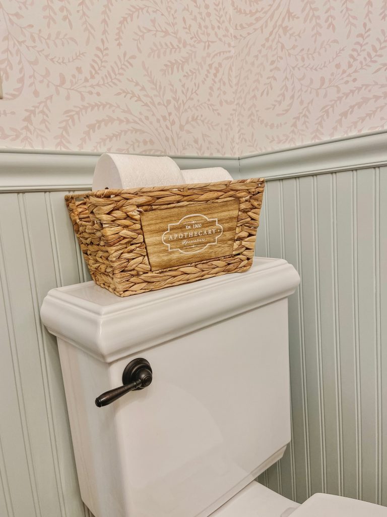
We kept the existing fixtures and changed out the milk glass shades to clear glass (we lost one shade during the wallpapering process but I’m happy with the change in the end). It’s a small room with a big impact and just may be my new favorite in the house!
As a side note, if you are planning to paint, I highly recommend ordering large painted swatches that you can hang and replace from Samplize. They have all the top paint brands and you typically have your swatches in hand the following day. These large samples made a world of difference in comparing and getting a better idea as to how each color will read in your space. You can check those out HERE.

