As many of you know, I’ve been helping to design and decorate homes over the past few years which is basically a dream come true for me! I began playing with paint colors when we moved into our home just over three years ago. Prior to that we had bounced from condo to condo where I never had much freedom to change anything. When we moved in to our home, I started slapping paint samples up on all of the walls. And when I say samples, I mean I went all out crazy! Seriously, you should see the shelves of sample paints we have collected in our garage. Jack loves it ;) But ultimately I began to uncover some of my favorite colors and took note that although there were 5 million shades of griege, I was easily able to narrow them down to a handful that I loved.
It wasn’t until I took Maria’s workshop a few months ago that I was able to clearly decipher that everything ultimately came down to the undertones when comparing all of the neutrals to one another. It finally gave confirmation as to why one greige could look amazing in my home, but ugly and dingy in another. What it comes down to is comparison. Compare, compare and compare and you’ll be able to see that some neutrals have green undertones and others have purple and depending on your furniture, carpet and other hard finishes, one color will ultimately rise up as the winner. Every home is different and when it comes to neutrals especially, there’s always the disclaimer that each color will look different in every home, and it can even vary from room to room. This isn’t to scare you (I promise) but rather to create an awareness that A) it’s smart to sample (or use a sample board) before you paint an entire room and B) you’re not crazy!
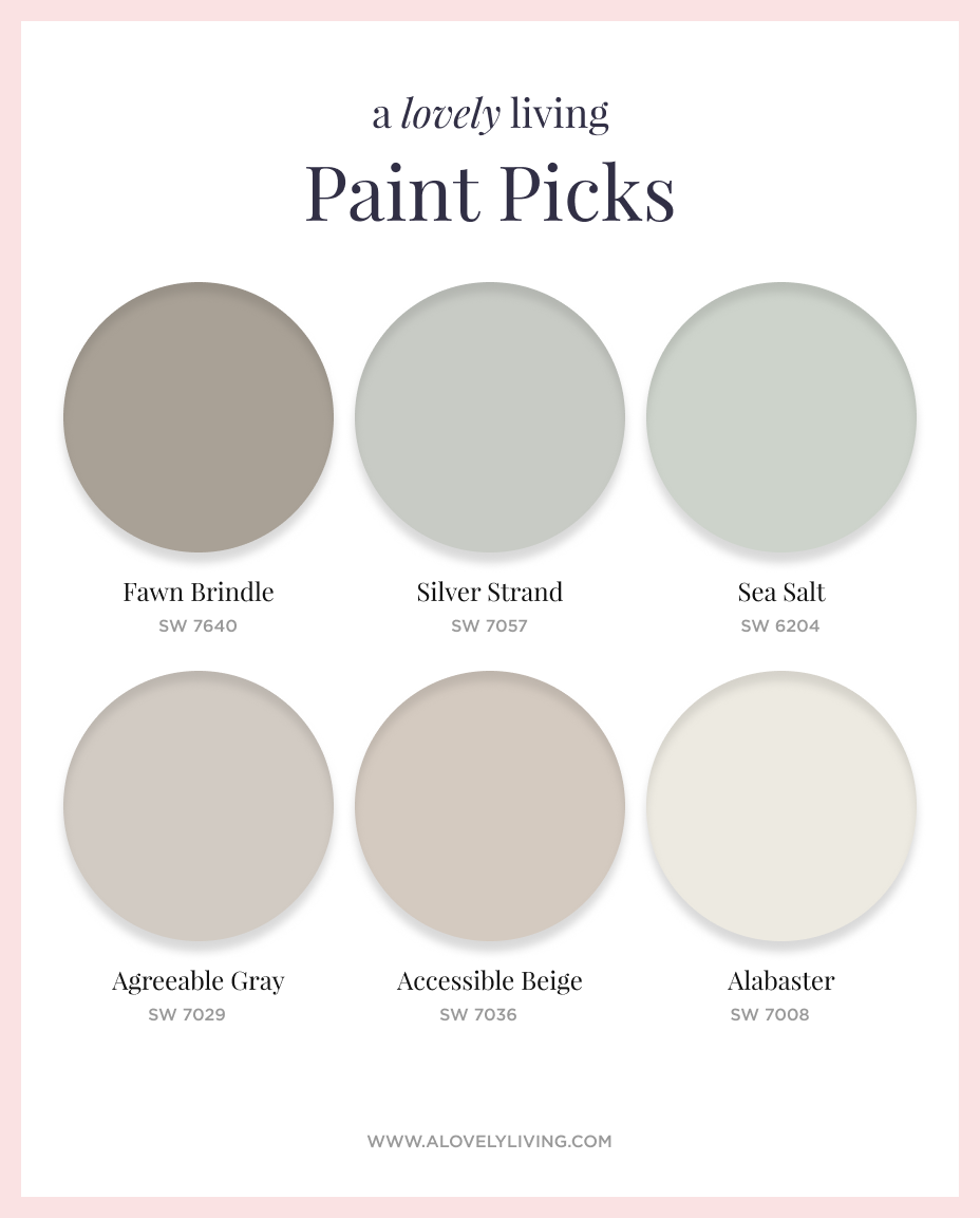
I do plan to discuss more on the topic in the future, but for now, I wanted to share six of my favorite paint colors that I have used time and again. I’ve been fortunate to work with a number of clients where I’ve handled everything from picking paint colors for a room or two to selecting every finish from the outside in on a new build. At least one, if not more, of these colors have been used on just about every project I’ve been involved with. And I should mention that my clients have loved them too, it’s not just me ;) So let me go into a bit of detail as to why I love each one and what spaces I’ve found them to be most useful in.

SW Accessible Beige: If I were to have a signature color, most of my clients would agree, it would be Accessible Beige. Although I love elements of gray in decor, I’m not one to go for typical grey walls. When I refer to ‘typical gray’ I’m referring to grays with a blue undertone and a cooler, crisper feel. I prefer the warmer grays/greige’s which is where this color falls. It’s also the color that I have running through the majority of our main floor, our basement, as well as our master bedroom and my sons room. When something works, run with it!
SW Agreeable Gray: I consider Agreeable Gray to fall within the greige category as well, although it certainly feels more gray than Accessible Beige. It has a warm violet undertone which keeps it feeling comfortable and inviting. It’s a very popular gray, as it should be!
SW Sea Salt: This color is such a dream. It is so soft, subtle and serene. It’s a mix of blue and green that in some rooms shows up looking more blue and in others the green can take charge. I don’t mind one way or the other because it always looks phenomenal. I adore this color in bathrooms or powder rooms as it looks beautiful next to the clean whites of the bathroom fixtures. I’ve also seen a number of people use it in their master bedroom where it can also look stunning.
SW Silver Strand: Silver Strand is what I turn to when I’m looking for something a bit more saturated and with a bit more punch than Sea Salt. It reads as more of a blue gray and is still soft and beautiful but with a richness to it. This is another color I turn to for baths and powder rooms.
SW Fawn Brindle: I love throwing this color into the mix of a color scheme. It’s another warm grey that adds beautiful contrast when you’re working with some lighter neutrals. I’ve used it in mudrooms and laundry rooms and love the visual interest it adds as you’re looking and moving from one room to another.
SW Alabaster: White walls seem to be the latest trend, but unless you have room after room full of bright, natural light, you may not be able to pull off an all-out bright white. Alabaster is such a pretty off-white that reads crisp and clean but at the same time offers a beautiful contrast to white trim and baseboards. I used this color in some bedrooms as well as the master bath of a project I recently wrapped up and I can’t tell you how many people were commenting on the color (the builders included!).
I’m most comfortable and have had much success with Sherwin Williams colors, but there are a number of colors from other brands that I’m quite fond of as well. We’ll have to hold out for another post on those down the road!
I’d love to know what some of your absolute favorite paint colors are. Share in the comments and let me know where you use them!
